
This article presents an approach that can be followed to create custom facelets components that generalize some ‘basic’ components’ functionality, and thus opening the door to customize and extend other characteristics, like the look and feel, for example. By ‘basic’ I understand JSF default components like h:dataTable, h:commandButton, although the code examples will use IceFaces components. Basic familiarity with the Facelets technology is necessary, as the usage in the code examples of tags like ui:insert and ui:include is not explained. Also, some prior exposure to JSTL is assumed. No extensive knowledge of the IceFaces technology is required, as a direct analogy with Java ServerFaces components can be done (ice:dataTable vs h:dataTable).
One of the main selling points of the Facelets technology is the templating mechanism. Suppose you want to create a web application, and one of the first things you do is to identify common ‘patterns’ in the layout of the system, like, one top area where you will have a main menu, maybe search and some navigation controls, and a bottom area, that contains two sub-regions, possibly a master and a detail.
So far, so good, but let’s say that you have identified some further commonalities, like the fact that you need to display data in many screens in the form of tables (tabular data), and in some screens you want to present to the user data in tabbed panels. Obviously, by implementing these functionalities, you will duplicate a lot of code. One solution to avoid the duplication is to create custom components, and the Facelets templating mechanism can turn out to be handy here.
The first part of this article concentrates on demonstrating the usage of the Facelets technology to create a custom component that looks and behaves like a tabbed panel.
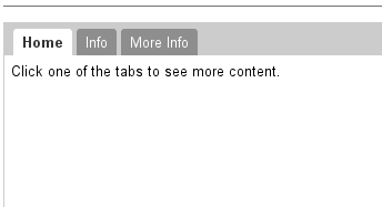
The following code example will be based on IceFaces’ tag used for creating tabbed panels, the ice:panelTabSet. The JSF specification does not offer such component. This component lets you build as many tabs as you want by nesting ice:panelTab tags.
The first thing you should notice is that you can pass parameters to the component, like the firstTabName that is a text token to be displayed as the first tab title. Second, let’s assume that you first tab displays some text (although any IceFaces component can be there) but you want to be able to also insert any kind of content under your text. Using Facelets’ ui:insert tag we can define an ‘injection’ point, that we can use to push any content to the bottom region of our first tab. In the same manner, we can define ‘injection’ points that help us push any content to the rest of the tabs.
An interesting observation is the fact that you can ‘turn on’ tabs just by specifying the tab name, since the ‘rendered’ flag of each panelTab will determine if the tab and its content will be included in the rendered response sent in the last phase of the JSF cycle. Please have a look at the client code that contains an example of this. The maximum number of tabs the component can support is determined by the number of specified panelTabs, but this could be, in theory, extended indefinitely by adding panelTabs inside a looping tag (c:forEach) that will create as many tabs as needed.
<!--
this content goes into a file named tabbedComponent.xhtml,
ui:composition wrapping tag omitted
-->
<ice:panelTabSet id="#{id}">

		<!-- First Tab -->
		<ice:panelTab
			label="#{firstTabName}"
			rendered="#{not empty firstTabName}">

			<ice:outputLabel>some text here</ice:outputLabel>

			<!-- bottom tab content insertion point -->
			<ice:panelGroup>
				<ui:insert name="firstTabBottomContent" />
			</ice:panelGroup>
			<!---->

		</ice:panelTab>

		<!-- Second Tab -->
		<ice:panelTab
			label="#{secondTabName}"
			rendered="#{not empty secondTabName}">

			<!-- second tab content insertion point -->
			<ice:panelGroup>
				<ui:insert name="secondTabContent" />
			</ice:panelGroup>
			<!---->

		</ice:panelTab>

</ice:panelTabSet>
Here’s how client code should look like. As you see, there is a great deal of flexibility involved. Moreover, as a demonstration, the first tab bottom content uses an include tag to add the content of a separated file and passes parameters to the file.
<custom:tabbedComponent
    id="my-tabbed-component"
    firstTabName="Properties">

    <ui:define name="firstTabBottomContent">
                <ui:include src="/files/myFile.xhtml" >
                        <ui:param name="parameter"
                              value="#{myBean.property}"/>
        </ui:include>
    </ui:define>

    <ui:define name="secondTabContent">
        <ice:outputLabel>2nd tab content</ice:outputLabel>
    </ui:define>

</custom:tabbedComponent>